
Enhance Cardstream's branding and visibility as a leading paytech with a sleek, modern website
Cardstream is an established, PCI DSS Compliant Payment Gateway offering tailored white-label solutions.
Team
Business Owner, Product Manager, UX Design Support, Engineers
Role
Product Designer - Competitive Analysis, IA Audit, Sitemap, Brand & Visual Design
Timeline
Jul 2020 - Dec 2020
Tools
Figma, Adobe XD

A leading paytech company founded in 1999. Cardstream offers a wide range of payment services, including transaction monitoring, payment facilitation, acquiring, routing, and onboarding verification and management.
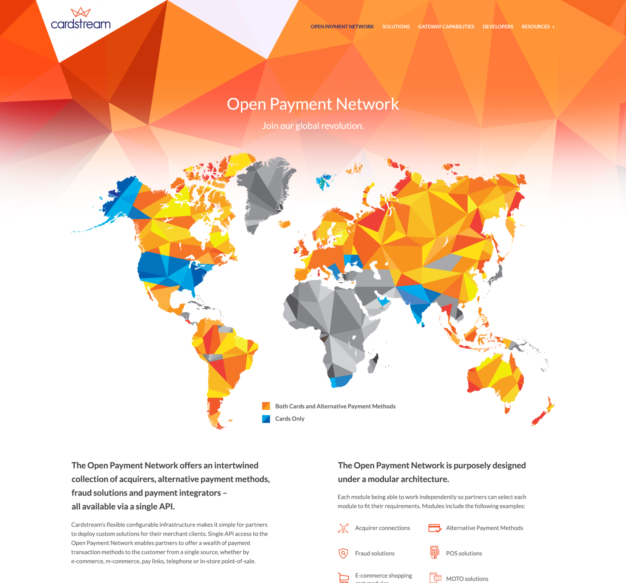
Through its Open Payment Network, Cardstream connects more than 400 global acquirers, fraud detection systems, commerce solutions, and payment methods across over 120 countries.
Overview

Cardstream faced tight development resources and a short timeline for their launch, with their new brand still in the exploratory phase. To tackle this, I worked closely with the team to refine the research and reevaluate user flows.
The focus was on improving the user experience and interface, as well as boosting landing page conversions, all while aligning with the evolving style guide. This was part of a broader effort to redefine Cardstream’s brand, enhance their web presence, and elevate their whitelabel payment gateway product.
The Challenge
Objective
To align their presence with their major competitors such as Paypal, Stripe and Nuvei
Boost mobile conversions by identifying opportunities to improve early in the funnel
Implementing web and mobile accessibility to ensure an inclusive and seamless experience for all users
Aligning new components with the updated style guide for a cohesive and on-brand design
Rethinking Legacy

Phase 1
No research or design process:
There was no real process to understand user needs or plan the design.
1999 – 2013
Basic development:
The site was built quickly using simple HTML and tables, skipping modern best practices.
Tight budget:
As a start-up, the limited budget meant fewer resources and less room for refinement.
Non responsive:
The site was desktop only and used Flash elements, making it unusable on mobile.

Phase 2
No UX methodologies:
There was no user focused approach, with no research or testing to guide the design.
2013 – 2016
Designs done in Photoshop
Designs were simple, created in Photoshop without structure, and based on a basic sitemap.
No branding:
The company lacked clear branding, leading to an inconsistent and forgettable experience.
Content heavy, low traffic:
The site had lots of content but little visitor engagement.
No imagery:
The lack of visuals made the site feel plain and uninviting.

Phase 3
Brand in progress, website rushed:
With the brand still being developed, the website had to be created quickly, leaving little time for proper planning.
2016 – 2019
No UX, quick template fix:
Instead of a proper UX process, a third party template was used as a placeholder to get something live fast.
Generic design:
The site looked like every other competitor, following the current design trends of that time.
With rapid growth and a solid budget in place, Cardstream decided to completely redesign its website, leveraging my design process to ensure the best results.
Phase 3 used a quick third party template, but the team wanted a better experience. I reviewed the design, mapped user journeys by key user types, and asked key questions to refine the experience.
Discovery


Once I mapped the existing flows, I had a clearer understanding of how they worked and what was missing. Next, I conducted research to identify existing patterns and proposed a new, user focused workflow, streamlining the journey by removing unnecessary steps.
The main goal was clear: reduce the content, add more visuals, and highlight the brand’s value. But I also recognised that the existing site had a lot of valuable information buried within it. This gave me a solid starting point as we began shaping the structure of the new page.
We took a step back to focus on the key benefits for users and used those as the foundation for designing the landing page and the rest of the pages.
Reduce, Re-use and Re-work
I began sketching wireframes for each page, focusing on clean layouts that combined engaging visuals with key information. These wireframes grew into interactive prototypes, which we tested with the business to get their feedback. This hands on process helped me fine tune/iterate the designs, making sure it showcased the brand’s value while staying user friendly.
Wireframing & Prototyping

Applying the new brand. Using the style guide to create new components, and component variants with all possible use cases.
Adopting the New Style Guide

Cardstream Brand Audit and Design Refinement
I started with a quick brand audit of key competitors like PayPal, Stripe, Stark, and Nuvei, focusing on how to differentiate Cardstream while staying true to its identity.
Once that was in place, I refined the early designs into the final version, aligning them with the new style guide and incorporating feedback throughout the process.
All new components were created, such as Data Cards, Atomic Elements, Accordions, Labels, Icons, Buttons, Forms, etc. Each of these components has variants that adapt for tablet/mobile, and each component has been stress tested, accessibility checked, and tested for worst case scenarios.
All components are documented for developers and any future designers to follow.
Creating New Components
The final product reflects a strong presence of the new brand, with minimal content and appealing colors. The design creates a clean and modern look that aligns with the brand's identity.
The new website got a lot of positive feedback from partners and acquirers, driven by a careful design process. I stuck to a detailed design plan and collaborated closely as a team to bring it all together.
Putting the Pieces Together


Five months after launch, we saw a 69% increase in visits and a 77% rise in new users compared to the previous website
The new website got a lot of positive feedback from partners and acquirers
I’m pleased to have helped Cardstream achieve their goal of enhancing the overall experience and look, aligning it with their new brand, and most importantly, improving the conversion rate. We transformed an outdated, content heavy website into an engaging product landing page that clearly highlighted the user benefits in well organised sections.
