
Stay in the loop and trade with confidence: Get timely alerts and notifications for smarter trading
A smooth experience with personalised updates that keep you informed and ready to act, so you never miss a moment in your trading history.
Team
Product Owner, Creative Directors, Business Analysts, UX Designer, Engineers
Role
Lead UI Designer - Visual design, User Research, Rapid Prototyping, QA and Accessibility
Timeline
Apr 2021 - Aug 2021
Tools
Sketch, Invision, Mural, Confluence

HSBC Private Banking aims to be the top global private bank for business owners and families, offering comprehensive solutions in key markets. Emphasising self service, we prioritise adapting to evolving client needs as they take a hands-on approach to growing their wealth.
As part of a specialised design team in Hong Kong and UK, we work quickly and collaboratively to create top notch digital experiences for HSBC Private Banking's ultra and high-net-worth clients worldwide, keeping users informed with alerts and notifications so they never miss an important trade when there are market movements.
Overview

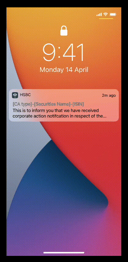
The current global banking app suffers from a poor user experience concerning alerts and notifications. Users frequently lose important notifications, struggle to find and configure notification settings, and miss critical alerts while engaging in online trading.
This inefficiency annoyed a lot of the customers, and several complaints made to HSBC’s customer support team. This has led to missed opportunities and financial losses in trades.
We had to address this quick, especially in a fast paced environment where getting timely information is key.
Problem Statement
Lost of important notifications
No way to see if there’s a new message received
Struggle to find and configure notification settings
Missing critical alerts
Messages couldn't be deleted, causing an overload
Customer complaints
Missed opportunities and financial losses in trades
Inefficiency undermines user confidence and satisfaction
To address these issues, a comprehensive design strategy will be implemented, focusing on user-centered design principles. The goal is to make the notification system more effective and easier to use, so users get clear, timely updates without any confusion.
The Process and Strategy
1.
User Research and Analysis
Talk to selected users through interviews, surveys, and usability tests to get a feel for their frustrations with notifications. Dive into the usage data to spot trends in missed alerts and trouble with setting configurations.
2.
Define User Personas
Work closely with the UX designer to create user personas that represent different types of users, including traders, customers, and tech savvy customers etc. This will help tailor the notification experience to meet varying needs.
3.
Map User Journeys
Develop user journey maps to visualise how users interact with notifications throughout their banking and trading processes. Find out what touchpoints where notifications are most essential.
4.
Ideation and Concept Development
Brainstorm solutions to address those key pain points, focusing on intuitive settings, customisable alerts, and improved visibility of notifications.
5.
Prototyping and Testing
Create low-fidelity and high-fidelity prototypes of the new notification system. Conduct testing with the users to gather feedback, collaborate with the tech team to ensure the solution is feasible, and validate the design.
6.
Implementation and Iteration
Collaborate with development teams to implement the new notification system. After launch, monitor user feedback and usage analytics, iterating on the design to further improve the UX.
As there were several features to address, and each feature works in conjunction with the others, we focused on identifying the key starting point of the notification journey. We listed the following features.
Onboarding
Entry Points / Routes
Message Center
Message Type and the Actions
Critical Messages and the Actions
Message Management
Notification Settings
Prioritise the Features

Mapping the User Journeys and Flows
We began by identifying user personas and worked with the core team to prioritise them. From there, each journey and flow was mapped out based on key features.
The features were also benchmarked against competitors to gather inspiration. Different types of alert pages, notifications, message management (which include the new swipe to delete functionality), and functional requirements were analysed, and all findings were collated to shape the core journeys and flows.


I worked with the UX designer to create low-fidelity wireframes, making sure the core interactions were smooth and effective before moving on to high-fidelity prototypes. We first shared these with the team and business to gather feedback, align, and validate the core journeys. Afterward, we built a prototype for internal testing before putting it in front of users.
We tackled one journey at a time, starting with the Onboarding Process and finishing with the Notification Settings journey. Throughout, we went through multiple rounds of iteration, testing, and sharing feedback with the team.
Wireframing & Prototyping

Final Execution
1.
UI Design & Visual Style
Create the visual design while keeping it consistent with HSBC's brand guidelines, design system, and accessibility standards. Any new components were validated with the Global Design Governance team.
2.
Accessibility
We prioritised accessibility, ensuring every component followed WC3 guidelines. This gave feature teams confidence that the design considered all user groups, helping to prevent potential lawsuits and costs.
3.
Flexibility
The system's modular design gives it plenty of flexibility. Its components fit together smoothly and can be combined in any way that works best for the user, across different platforms.
4.
Building the Structure
We listed all platform components and organised them into atoms, molecules, and organisms. Starting with atoms - our core design elements like typography, colors, and spacing. All these form our global foundations.
5.
Documentation
All final designs were documented for any future enchancements. This included research, detailed specs, and accessibility screen reader sequencing, all built with WCAG 2.1 compliance in mind.
6.
Aesthetic
Enhancing the viewing experience is crucial, following Jakob’s law, as users expect a clean, modern design like the sites and apps they frequently use.

Onboard Process

Message Center

Notification Settings


By sticking to our process from the beginning, we hit our goals, turning challenges into solutions along the way. User testing went really well, but since my time on the project was a bit short, I didn’t get to see how all the new features in the updated app landed with users.
The design team is still hard at work, iterating for the next release with fresh features; features that were placed in the parking lot during discovery. They’re committed to improving the notification experience in the global banking app, making sure users stay informed and engaged, especially during important trading moments. By focusing on user-centered design, they’re aiming to create a more intuitive, reliable, and satisfying experience.
Results
Rule of thumb for UX: More options, more problems.
Overloading users with options can confuse and frustrate, rather than empower them. Simplifying choices can lead to a smoother, more enjoyable experience.